Kalou wrote:Thoughts?
LMAO!!! I expressed as much over at GS, but seriously - this thing is ugly has FUUUUUUUUUUUU UU U U UUUUU UCK. Jesus - it's like a bad 80's Japanese t-shirt, the Republican party colors, and a Minecraft redstone had a baby.



Kalou wrote:Thoughts?


Kalou wrote:Thoughts?

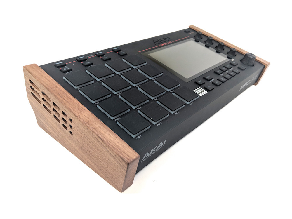
Monotremata wrote:Enoch summed up my thoughts on it at Gearslutz too.
God damn that thing hurts my eyes just looking at it. Kill it with fire.
I really wish someone in R&D would spend some time coding the **** sampler and fixing some of their bugs instead of paying some jackass to color the faceplate in some stupid color scheme. Between this and the gold, its no wonder nobody ever rants and raves about Akai's aesthetics.. At least the real Akai kept their designs looking like NASA research equipment. You would've never seen that god awful fluorescent orange MPC2K come out of the JP factory. You got plain old lab looking equipment, but it WORKED and alot of it STILL works today.
(Seriously, just looking at the previous posts while I was typing my reply, my eyes now have that bright red block burned in them when I blink)

 This x10000
Lampdog wrote:I LOVE my Orange 2kxlse2!
Lampdog wrote:I LOVE my Orange 2kxlse2!
Monotremata wrote:
HAH! I almost bought one at Guitar Center like 15 years ago but I just couldn't do it! That actually wouldn't look too bad, Ive got the big puke orange Microwave XT sitting right next to me so it would be right at home here.
And yeah, there is something about the frequency of that red color in that mockup that is like stabbing my eyes. Every time I see it, it feels like I just stared into a light bulb for a few seconds and I get this bright spot in the center of my vision. I know Im getting old but this might be the 5G disease kicking in!
Monotremata wrote:And yeah, there is something about the frequency of that red color in that mockup that is like stabbing my eyes.