Support and discussion for all of Akai’s modern standalone MPCs including the MPC X / X SE, MPC Live 1, 2 & 3, MPC One / One+, MPC Key 37/61.
By 40Beatz Sun Dec 21, 2025 6:11 am
Image

IDK
User avatar
By THXjay Sun Dec 21, 2025 11:59 am
The knobs look weird but it may just be the angle of the picture. it looks like they may have an illuminated ring around them for dark studios :)
It's strange having the Q-Links in a row after seeing them in a grid for so long but to be honest I do think it looks better from a design point of view and most screens aren't really laid out 4x4 anyway so this is OK with me, though I would have thought that having the OLED screens underneath the knobs would be better, rather than the knobs obscuring them!

I hope they hav edropped the glossy black plastic crap on the old X, I hated that. Not too keen on the new transport buttons but we'll see how they are in the flesh.

It all looks genuine to me but I can't work out why it is gold??? Surely they would have gone with standard black for the initial release, gold is a love-it-or-hate-it choice.

Exciting times ahead!!
User avatar
By kja Sun Dec 21, 2025 1:35 pm
mpc_fan_2022 wrote:Where do they go from here? From a hardware perspective? aside from a better CPU and more RAM?

I hope they have learned a lesson from so many editions and we’ll just work on the keyboard, new force, cheaper mpc, and maybe a micro thing. Other then that leave it alone.. start working on a completely new generation, or even better a new idea like a vintage series while you build up the software side.
By B-Wise Sun Dec 21, 2025 1:41 pm
THXjay wrote:The knobs look weird but it may just be the angle of the picture. it looks like they may have an illuminated ring around them for dark studios :)
It's strange having the Q-Links in a row after seeing them in a grid for so long but to be honest I do think it looks better from a design point of view and most screens aren't really laid out 4x4 anyway so this is OK with me, though I would have thought that having the OLED screens underneath the knobs would be better, rather than the knobs obscuring them!

I hope they hav edropped the glossy black plastic crap on the old X, I hated that. Not too keen on the new transport buttons but we'll see how they are in the flesh.

It all looks genuine to me but I can't work out why it is gold??? Surely they would have gone with standard black for the initial release, gold is a love-it-or-hate-it choice.

Exciting times ahead!!
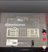
Yeah, I can see the knob are wider & shorter. The little knobs screens on top is better as they are less likely to get blocked by your hand. I like the light on top of knob. The knob are setup like the Force but with has 16 horizontally. I think know if this is gonna be an improvement or not, but I might had preferred 2 rows of 8, but this may be better.

No crossfader & the lack of real 64 pads make this a pass for me & hope they make a new Force. If they did do make it, it would be the co-flagship.

The color reminds of that black & white cookie from Sienfeld :lol: