Support and discussion for all of Akai’s modern standalone MPCs including the MPC X / X SE, MPC Live 1, 2 & 3, MPC One / One+, MPC Key 37/61.
User avatar
By MPC-Tutor Sun Sep 28, 2025 3:29 pm
The seamingly random placement of the shift button on different units really irks me.

instrumental wrote:While I'm excited for the new approach, I'm already starting to notice the classic Akai fumble. For instance, if these buttons are not backlit, that red is going to be damn near impossible to see in certain lighting. I'm looking at these buttons and trying to find Shift...this really raises a lot of questions for me. First, for a button that will be getting as much use as Shift, why put it in such close proximity as the other buttons? Second, is the red color to denote primary or secondary function? If primary, why would you make it so difficult to read? If secondary, why is Shift red when it's the only function? Even more than this, look at the placements of the button labels - some are on the top, some are on the bottom, some are on the case. There's seemingly ZERO focus. At first I thought red was to denote REC functions, but then that doesn't explain the top row of buttons. I really hope this makes sense once sitting in front of the thing.

Also, there's a TON of real estate to the right of that touch strip wasted on division labels. This section really should have been an assignable crossfader or two.
By BeatWilson Sun Sep 28, 2025 3:48 pm
It looks alright. It's a bit crowded, a bit too colorful(backlit lights), but it could be worse.
The only part I don't like is the OS and if they used the same Encoder as the original Live1/Live2.
I didn't love the feeling of it, and the X felt a to better.
I would almost be happier with a better encoder that doesn't press in like a button, and then just put an enter button next to it. That way the Encoder wont get so.. Loose/Wobbly or whatever.
By Kamera2K Sun Sep 28, 2025 4:46 pm
instrumental wrote:While I'm excited for the new approach, I'm already starting to notice the classic Akai fumble. For instance, if these buttons are not backlit, that red is going to be damn near impossible to see in certain lighting. I'm looking at these buttons and trying to find Shift...this really raises a lot of questions for me. First, for a button that will be getting as much use as Shift, why put it in such close proximity as the other buttons? Second, is the red color to denote primary or secondary function? If primary, why would you make it so difficult to read? If secondary, why is Shift red when it's the only function? Even more than this, look at the placements of the button labels - some are on the top, some are on the bottom, some are on the case. There's seemingly ZERO focus. At first I thought red was to denote REC functions, but then that doesn't explain the top row of buttons. I really hope this makes sense once sitting in front of the thing.

Also, there's a TON of real estate to the right of that touch strip wasted on division labels. This section really should have been an assignable crossfader or two.



Seems pretty straight-forward from the picture though? Shift label is red, at the bottom of its button, nothing on top. Secondary functions are labelled in red at the bottom of the buttons, or labelled white under them– keeps the transport buttons clean when lit, and the step buttons are too small for some of those labels.

I'd assume they're lit or semi-lit, like they are on the OG Live
By instrumental Sun Sep 28, 2025 5:21 pm
Kamera2K wrote:
instrumental wrote:While I'm excited for the new approach, I'm already starting to notice the classic Akai fumble. For instance, if these buttons are not backlit, that red is going to be damn near impossible to see in certain lighting. I'm looking at these buttons and trying to find Shift...this really raises a lot of questions for me. First, for a button that will be getting as much use as Shift, why put it in such close proximity as the other buttons? Second, is the red color to denote primary or secondary function? If primary, why would you make it so difficult to read? If secondary, why is Shift red when it's the only function? Even more than this, look at the placements of the button labels - some are on the top, some are on the bottom, some are on the case. There's seemingly ZERO focus. At first I thought red was to denote REC functions, but then that doesn't explain the top row of buttons. I really hope this makes sense once sitting in front of the thing.

Also, there's a TON of real estate to the right of that touch strip wasted on division labels. This section really should have been an assignable crossfader or two.


Seems pretty straight-forward from the picture though? Shift label is red, at the bottom of its button, nothing on top. Secondary functions are labelled in red at the bottom of the buttons, or labelled white under them– keeps the transport buttons clean when lit, and the step buttons are too small for some of those labels.

I'd assume they're lit or semi-lit, like they are on the OG Live


The red=shift (REALLY hope this is backlit) makes sense, and that crossed my mind. However, the lack of placement consistency on the transport section is what's throwing me off. Also, to put the main shift button directly after other buttons you'd also use with shift with isn't a great ergonomic/workflow choice when there's also a bunch to the right of that, even. At least the OG MPC color scheme does a good job of denoting sections by creating that colored box around groups. I really would have liked to see something similar here, especially when dealing with so many buttons.

That said, I CAN see what they were trying to do here. I'm sure it will make sense when in front of the unit, but I'm getting the same feeling I got when I first realized there was no consistency with Q-Link screen placement. The OS is going to be doing some heavy lifting here.
By Kamera2K Sun Sep 28, 2025 5:55 pm
instrumental wrote:The red=shift (REALLY hope this is backlit) makes sense, and that crossed my mind. However, the lack of placement consistency on the transport section is what's throwing me off. Also, to put the main shift button directly after other buttons you'd also use with shift with isn't a great ergonomic/workflow choice when there's also a bunch to the right of that, even. At least the OG MPC color scheme does a good job of denoting sections by creating that colored box around groups. I really would have liked to see something similar here, especially when dealing with so many buttons.

That said, I CAN see what they were trying to do here. I'm sure it will make sense when in front of the unit, but I'm getting the same feeling I got when I first realized there was no consistency with Q-Link screen placement. The OS is going to be doing some heavy lifting here.


Yeah that makes sense. When I had a Maschine+, the shift button was right in the transport, but also in a corner with the other set of buttons far enough away, so it was really easy to feel out. The new MPC's is pretty tight in there. I'm sure it'll just have to be a muscle memory thing.

Also with you on reeeaally hoping those shift functions are backlit. I don't see why they wouldn't be, but you never know. In one of the pictures from that Czech shop leak, the close-up with the Touch Strip / Config button, it's tough to make out the red Config label... while in the close-up with the record button, it's very clearly lit and easy to make out. Hopefully that's just the photos.
By JackD Sun Sep 28, 2025 7:34 pm
dustyslices wrote:it doesn't seem to have that soft touch rubberized coating :)


I thought the same and I really hope it! Let’s see
User avatar
By Ultros Sun Sep 28, 2025 11:15 pm
B-Wise wrote:I told you guys they took MPC clips to replace it with the superior Force clip-matrix system. This Live 3 has 16 function buttons which is 2x the amount of the Force. That's amazing! Being able to mute/solo 16 tracks/pads while banging on 16 drum 3D MPCe pads & a touchstrip will take shit to a higher level!


Nothing about anything beyond midi and audio clips. no plugin clips, cant record to clip. its not going to be what you think it is. it sounds alot like they gave the matrix but didnt give the full functionality of it.
By Certified Beatz Mon Sep 29, 2025 12:47 am
Since Live 3 will have MPCe pads. It will be interesting to see all software out like Arturia plug-ins sound this will be nice additions.. it's not time for me to jump even after the top 10 YouTubes videos and inmusic..

All the following Arturia software titles are compatible with the MPE mode:

Augmented BRASS
Augmented GRAND PIANO
Augmented STRINGS*
Augmented VOICES
CMI V
CS-80 V4
CZ V
Emulator V
Jun-6 V
Jup-8 V
KORG MS-20 V
OP-Xa V
Pigments
Prophet-5 V
Prophet-VS V
SQ80 V
Vocoder V

Worth upgrading if you own these I do I'll still wait :-D
By B-Wise Mon Sep 29, 2025 1:25 am
Ultros wrote:
B-Wise wrote:I told you guys they took MPC clips to replace it with the superior Force clip-matrix system. This Live 3 has 16 function buttons which is 2x the amount of the Force. That's amazing! Being able to mute/solo 16 tracks/pads while banging on 16 drum 3D MPCe pads & a touchstrip will take shit to a higher level!


Nothing about anything beyond midi and audio clips. no plugin clips, cant record to clip. its not going to be what you think it is. it sounds alot like they gave the matrix but didnt give the full functionality of it.

Wink if you got some insider info, but MIDI clips could also include plugins & drum track clips. It would make sense to not include all track types on the system that's 4x more powerful at some point. It would also help to justify take the old program style.
User avatar
By hyena Mon Sep 29, 2025 8:12 am
B-Wise wrote:It would also help to justify take the old program style.


hmm, not really. the issue with losing programs is mainly felt by those who use mpc's live. with programs you can do a long liveset fit in a single project, without the need of using milions of tracks, because when you need to switch to a new instrument in a new sequence you just load a new program inside a track. plus you can have different tracks in the same sequence referencing the same program so , with the mute\unmute trick, you can have,say, variations of the same drum kit inside a single sequence, hence be able to make variations of various instruments individually without having to switch to a new sequence just to make a bassline variation. these are the two main reasons why for me the absence of programs totally kills the usability of the mpc in a live context. if you are just producing , so one song per project, you dont really need programs (even tho they come in handy for some nice tricks here and there).

i hope this clarifies the matter for all those who say we are just grumpy old complainers who hate novelty.
By B-Wise Mon Sep 29, 2025 9:21 am
hyena wrote:hmm, not really. the issue with losing programs is mainly felt by those who use mpc's live. with programs you can do a long liveset fit in a single project, without the need of using milions of tracks, because when you need to switch to a new instrument in a new sequence you just load a new program inside a track. plus you can have different tracks in the same sequence referencing the same program so , with the mute\unmute trick, you can have,say, variations of the same drum kit inside a single sequence, hence be able to make variations of various instruments individually without having to switch to a new sequence just to make a bassline variation. these are the two main reasons why for me the absence of programs totally kills the usability of the mpc in a live context. if you are just producing , so one song per project, you dont really need programs (even tho they come in handy for some nice tricks here and there).


B-Wise wrote:Wink if you got some insider info, but MIDI clips could also include plugins & drum track clips. It would make sense to not include all track types on the system that's 4x more powerful at some point. It would also help to justify take the old program style.


I meant to put, It *wouldn't make sense to not include all track types (*for clips) on a system that's 4x more powerful at some point. It would also help to justify *taking way the old program style.

I get why the old way was valuable & that's why I was trying to say that if the MPC doesn't get the full clip matrix it wouldn't had been worth taking way the old program style.

I hope that's more clear.
User avatar
By hyena Mon Sep 29, 2025 9:39 am
yes, thanks for clarifying. i get that a clip matrix would make sense also for playing live, but that we already have, its called ableton live, or push , if you want it standalone. not saying its a bad thing to have inside an mpc , but i really like the mpc way of dealing with a liveset, and i really cannot grasp why ditch the entire thing... is the whole sequence\track\program paradigm perceived as a difficult thing to grasp?
By jpeg Mon Sep 29, 2025 9:51 am
the most eagerley awaited Akai product demo vid ever is coming this week, :lol:

but from the specs it seems Akai are on the money, as far a delivering the expectations of the next gen MPC's

and from my recollections there are 3 other MPC's to come in this next gen range.

Think the new X 2 flagship will be next year; but the other two might come later.

Maybe the MPC One Two or MPC TWO

The last unit in the next gen range is a mystery, either a Force2 or perhaps even the mythical Live Mini, who knows
By sinik Mon Sep 29, 2025 9:59 am
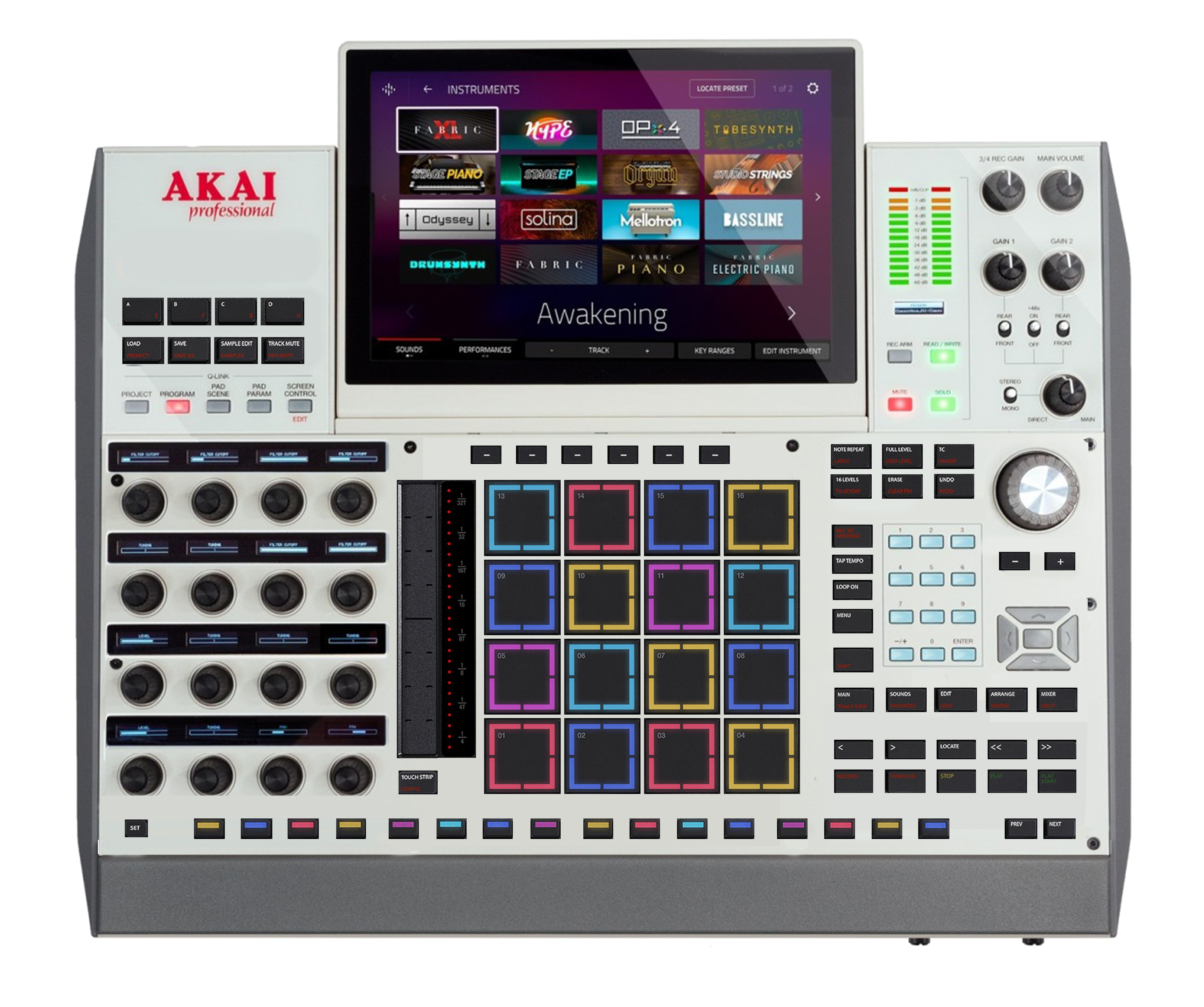
did a concept for the mpcx, based on the new live 3.
button size is the same, just different/more spacing between them.
re-arranged the buttons to where it made sense to me.

the new stepseq buttons are on the bottom, im not sure if i like it that much tbh.
also, the pads are not centric anymore if you apply a touchstrip.

https://postimg.cc/S2KhGNSq

Image

..if somebody want to post the image, feel free, it doesnt work unfortunately