By MPC-Tutor
Sun Sep 28, 2025 3:29 pm
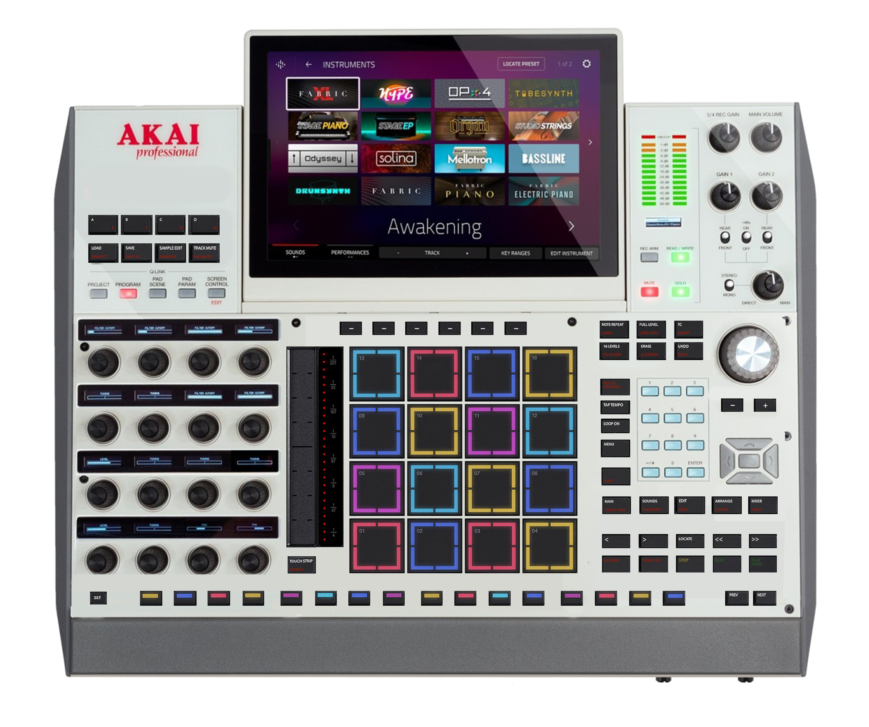
The seamingly random placement of the shift button on different units really irks me.
instrumental wrote:While I'm excited for the new approach, I'm already starting to notice the classic Akai fumble. For instance, if these buttons are not backlit, that red is going to be damn near impossible to see in certain lighting. I'm looking at these buttons and trying to find Shift...this really raises a lot of questions for me. First, for a button that will be getting as much use as Shift, why put it in such close proximity as the other buttons? Second, is the red color to denote primary or secondary function? If primary, why would you make it so difficult to read? If secondary, why is Shift red when it's the only function? Even more than this, look at the placements of the button labels - some are on the top, some are on the bottom, some are on the case. There's seemingly ZERO focus. At first I thought red was to denote REC functions, but then that doesn't explain the top row of buttons. I really hope this makes sense once sitting in front of the thing.
Also, there's a TON of real estate to the right of that touch strip wasted on division labels. This section really should have been an assignable crossfader or two.